YouTube Ads Prototyping Tool
An internal tool for prototyping new YouTube ad formats. Built and shipped production features, and designed its next generation for non-engineers and broader adoption.
A prototype of the redesign in React/Vite/TypeScript/CSS. Doesn't connect to any real data or services.
Note: These screens are my own redesigns. Copy, labels, and advanced settings were rewritten or invented to protect Google's confidential information — some deliberately unrelated to the real tool.
The problem
Even small changes to prototypes for research studies required engineering hours.
Testing a new YouTube ad format starts with a working prototype, something a research participant can actually click, scroll, and react to. The Ads UX Engineering team had built an internal prototyping tool for this, but it was mostly a UI wrapper over required knowledge of HTML/CSS/JS, so in practice only our own team used it.
This meant that every new ad format — even a small tweak to an existing one — required engineering hours to prototype. The team wanted to make the tool self-serve, so UX designers and researchers could build their own prototypes without needing an engineer on call.
Challenge
Can we make this tool accessible to non-engineers?
I worked on this tool from both sides. As a UX engineer on the team, I built and shipped production features on the live tool in Lit and TypeScript and used it to deliver prototypes for real research studies.
In parallel, I investigated its next generation: the version UX designers and researchers could pick up without us. I left Google before the redesign shipped, so this case study covers both the production work that shipped and the design work I handed off.
Research
UX designers and researchers weren’t just untrained on the tool — they were unconvinced.
While the new design took shape, I kept building the current tool and building with it:
- Built functioning prototypes of YouTube Shorts ad formats used in live user research studies.
- Designed and shipped new production functionality in the tool itself.
Working in the tool daily helped make the redesign concrete, and learning the tool drove the beginning stages of research.
I also talked to the people it was eventually meant to serve. UX designers and researchers weren’t just untrained on the tool — they were unconvinced. They had UX engineers to build prototypes for them; learning a new tool was a cost with no obvious payoff.
That reframed the bar for the redesign: it couldn’t just be possible for non-engineers to use — it had to be easier than asking us. This meant we couldn’t expect non-engineers to write code and handle the hard cases, but we could expect them to do the parts that were easier to do than to wait for someone else to do them.
Design principles
Templates, components, familiar language, and the obvious path is the easy path
The redesign came down to a few commitments:
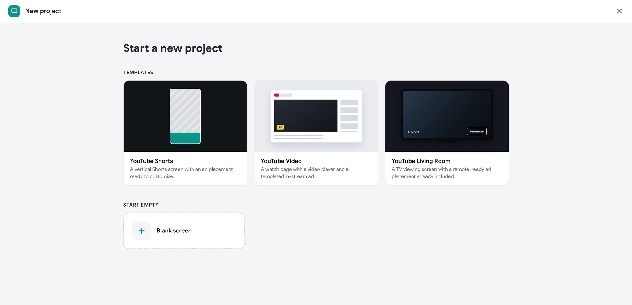
- Start from YouTube templates and components, not empty boxes: nobody in Ads needs to begin from scratch — it’s always an iteration
- Rich components with smart options: UX engineers build components that are flexible and powerful, and the tool surfaces these options without requiring code
- Reveal complexity progressively: hide advanced settings until they’re asked for
- Group functionality: so screens read as a handful of decisions, not a wall of settings
- Borrow Figma’s interaction grammar: designers should feel like they already know the tool
- Make the interface legible to newcomers: clear imagery, icons, and tooltips over assumed knowledge
The redesign
- A visual overhaul, to make the tool feel modern and worth choosing
- Clear groupings of functionality and settings, to reduce cognitive load
- Bold, obvious interactions modeled on tools designers already use
My benchmark flow was a first-time user’s first fifteen minutes: they would start with a template, add pre-made YouTube components to a board, wire up simple interactions, and then be able to export a working prototype. This path should feel intuitive and effortless. Advanced usage through custom components, variables, conditional logic, etc. would stay available, but never in the way.
A new user logs in with no projects, and is immediately guided to start a new project using a template.
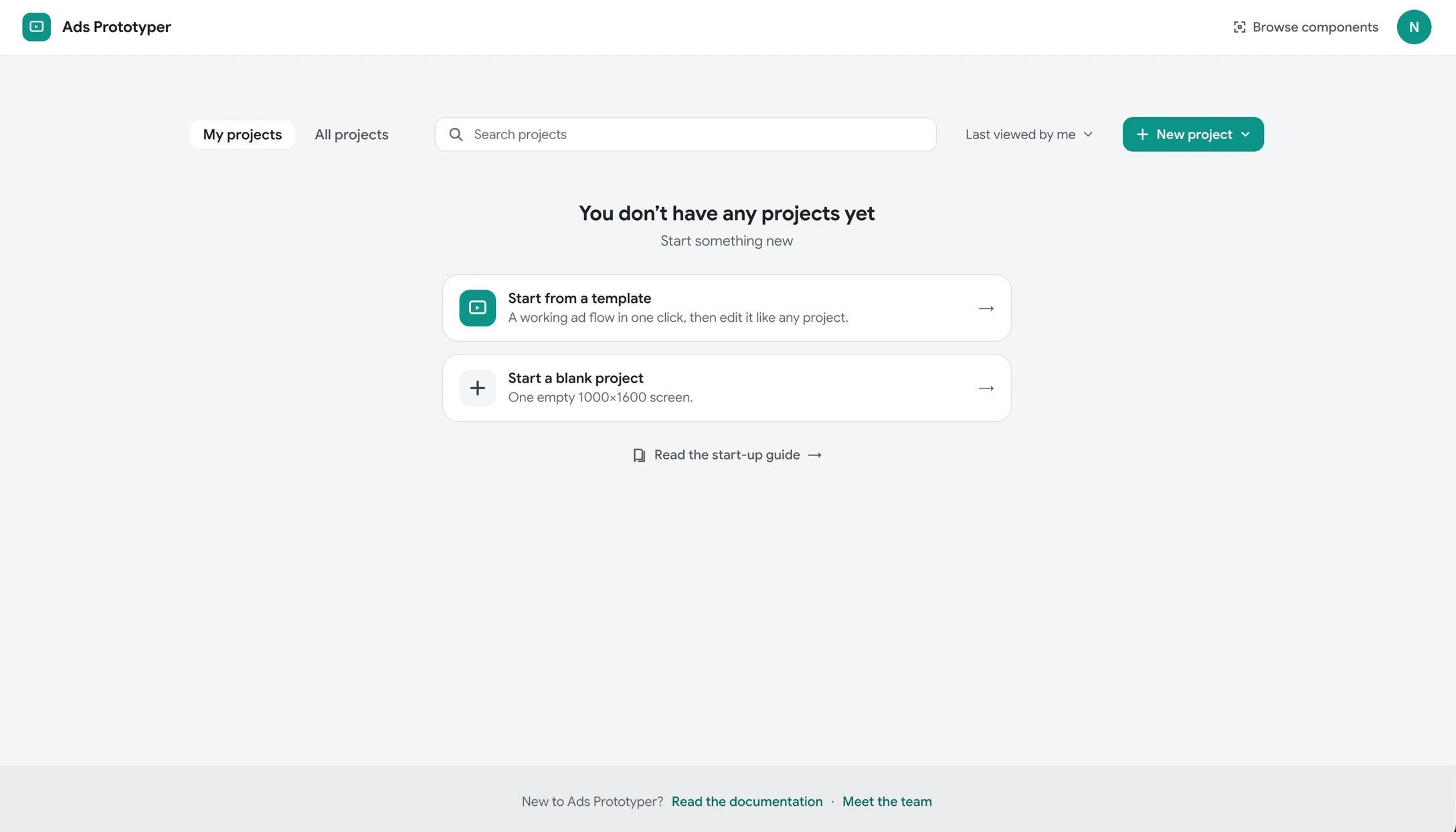
Templates make starting from scratch more approachable, and empower the user to start creating.
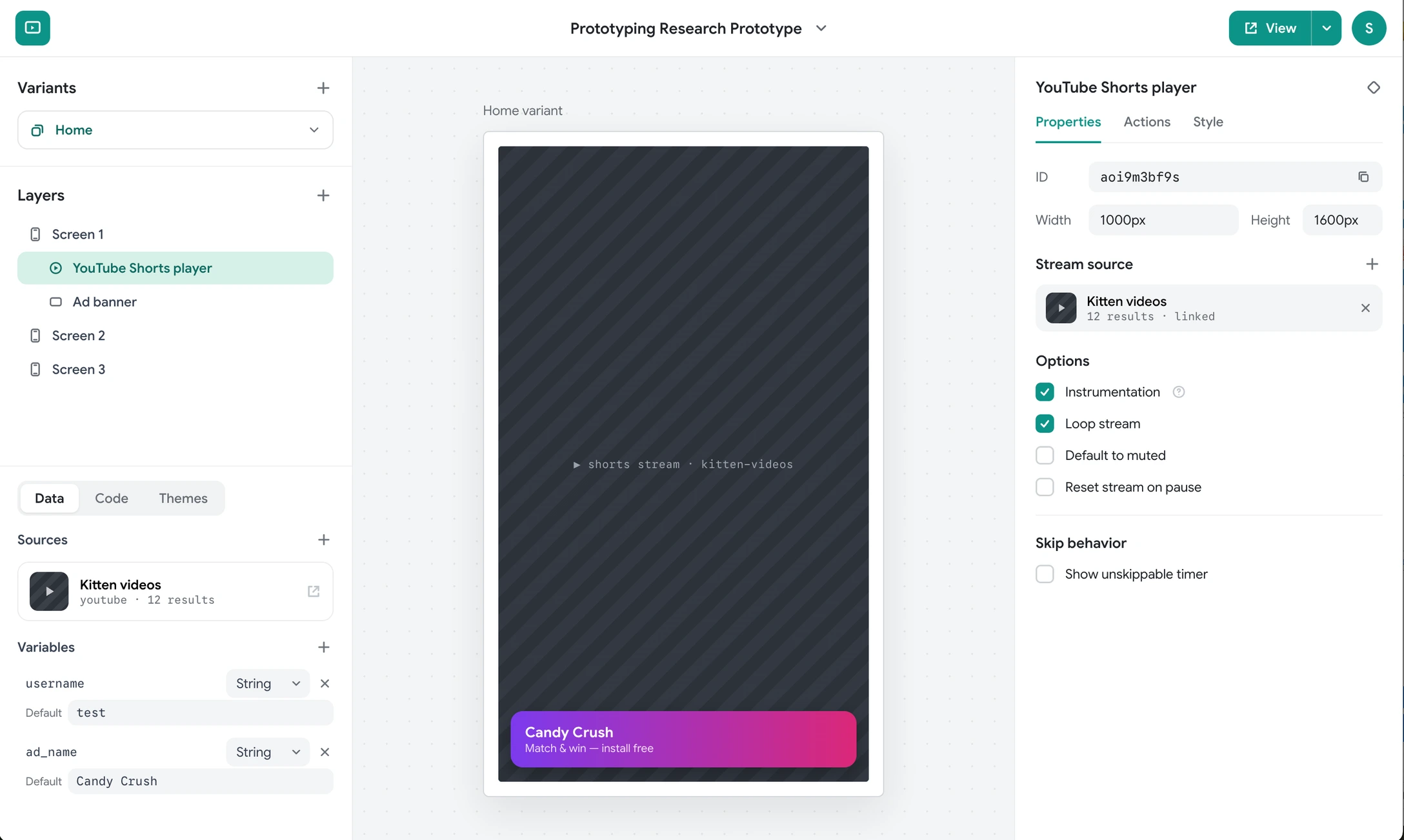
Sections are borrowed from known tools like Figma, so users can reason about the interface without learning a new interaction grammar. Layers and variants (for experiments) on the left, data that applies to the entire project on the bottom left, and properties and options that apply to only the selected element on the right.
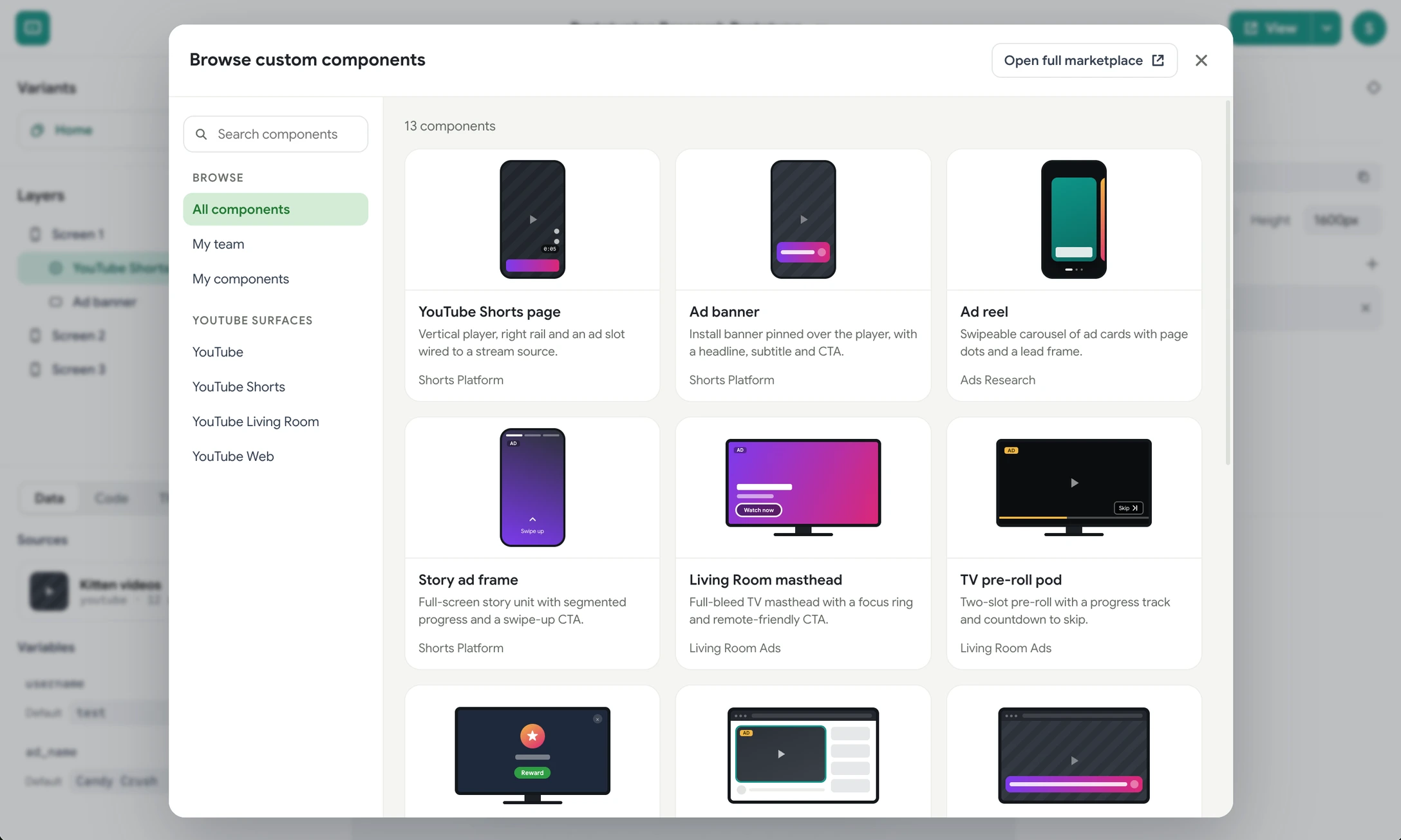
A long list of custom components is searchable across teams, so users can build with building blocks provided by UX engineers without needing to know how to code.
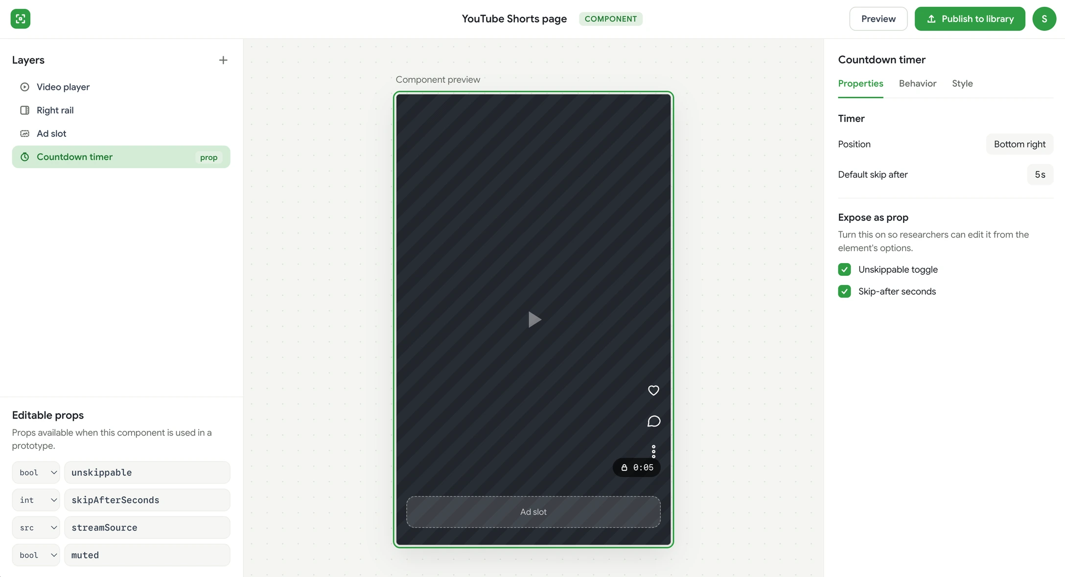
The components editing screen is visually distinct from the prototyping editing screen, but keeps the same conventions. Users are encouraged to create their own components for reuse.
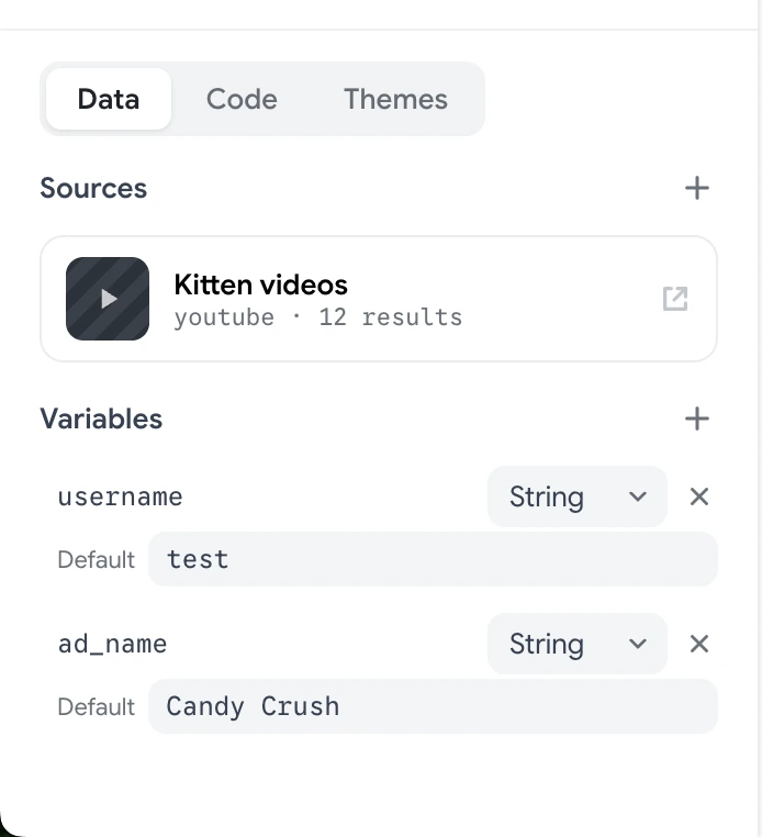
Data, code, and themes are unique to this tool. They allow the user to have a lot of fine-tuned control over the prototype, and may require a UX engineer for tail-end use cases. But the redesign surfaces the most common options first, and hides advanced settings until they’re needed.
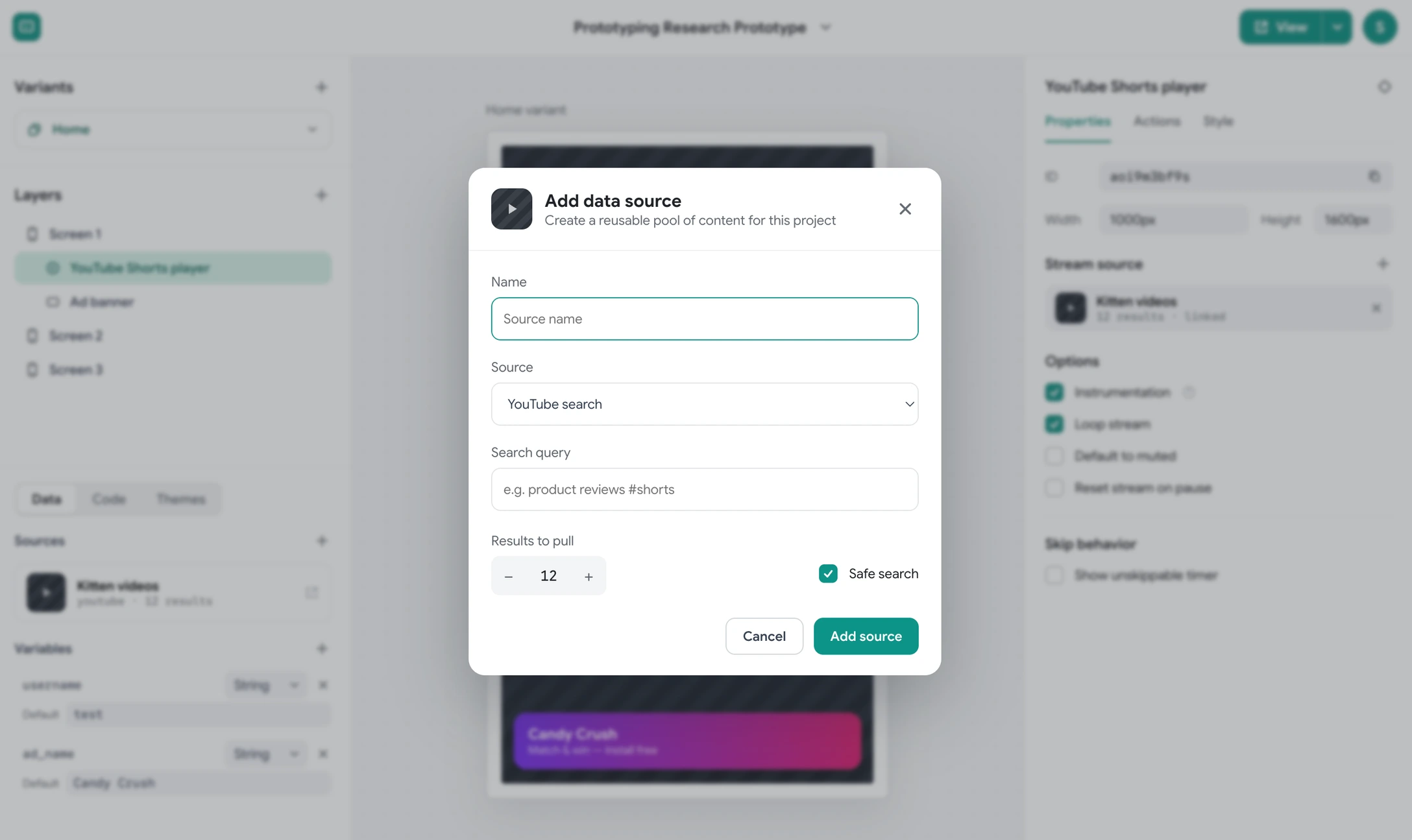
Data sources are added and linked to YouTube streams to make the project real and usable without needing to write code.
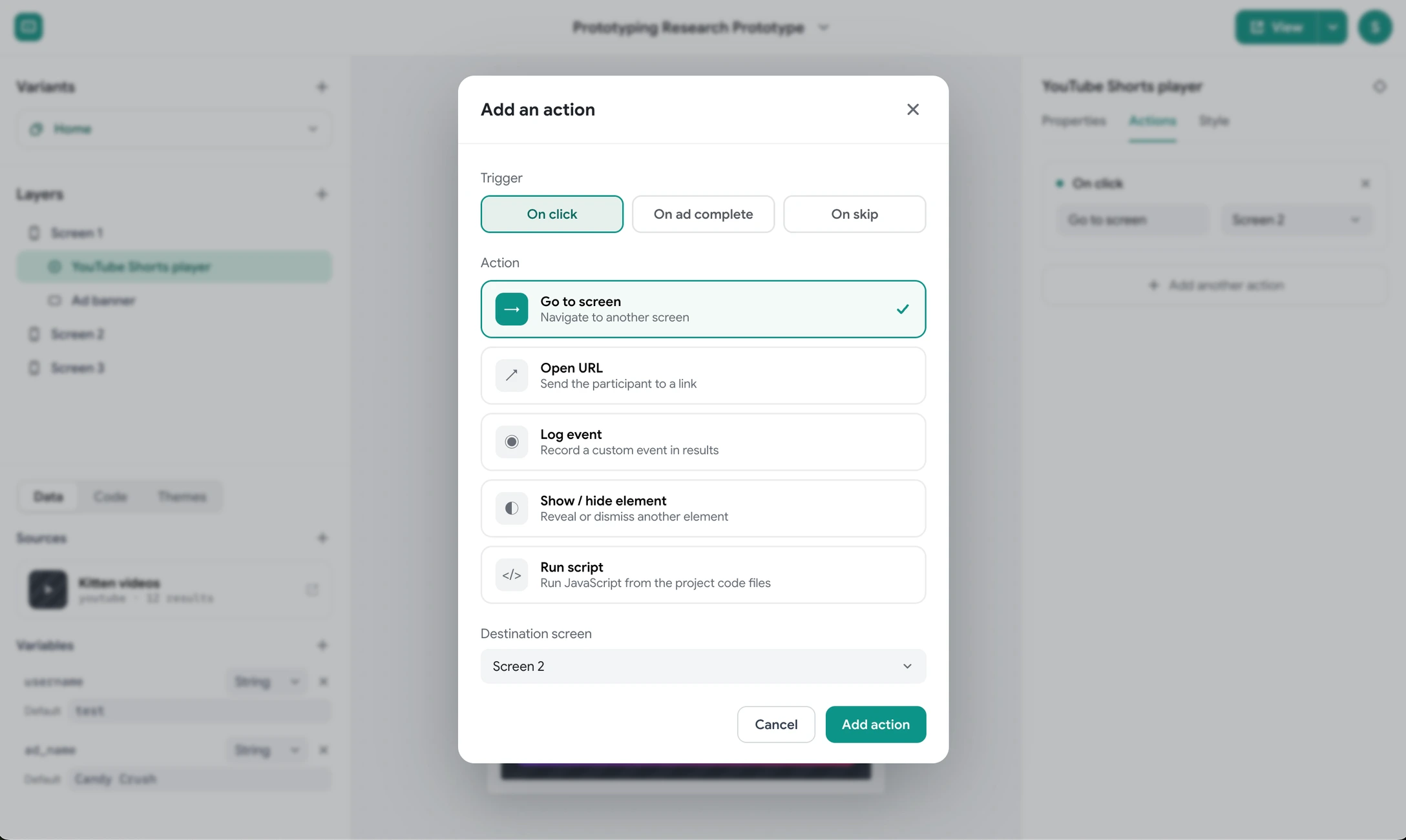
Actions allow for interactivity without writing code, but the option to trigger scripts is still available for advanced users and custom interactions.
Where it goes next
A division of labor, not full self-serve
I left Google in October 2025, before the redesign shipped. The production features I built along the way are part of the live tool.
What the work established:
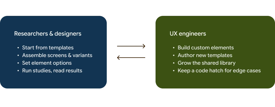
- A sharper problem definition. The goal isn’t to remove engineers from the loop — it’s to move us to the highest-leverage part of it. Researchers and designers own the assembly; engineers grow the library underneath them.
- A tested design direction. Components-first authoring, progressive disclosure, and a Figma-native interaction grammar, validated against the exact moments where real users stalled.
- The case for the audience. The research documented why designers and researchers weren’t converting, giving the team a target for the next version rather than a hunch.
The goal isn’t to remove engineers from the loop — it’s to move us to the highest-leverage part of it. Researchers and designers own the assembly; engineers grow the library underneath them.
Takeaways
Designing a tool while maintaining its production codebase is my favorite way to work — the design and the implementation inform each other in both directions.
In this project, the interesting problem isn’t really the editor, but rather the structure underneath it. Questions about what lives in the library, who builds it, and how much a non-engineer can do before they need help.